The homepage is a very important page of your website. It is the first impression about your business in the digital world we leave in. The question is what to put on your website homepage to not only make a perfect impression but also improve your conversion rates.
In this blog post, we will not look at the most obvious elements that your website should already have, like intuitive navigation or how it should be optimized for mobile devices. Rather will discuss the homepage elements/information that directly influence visitors’ decisions to become your customer.
So whether you’re just starting out with a new website, or you’re looking to refresh your existing homepage design, keep reading to find out what sections of the homepage will secure more clients for your business!
A hero section with your tagline & mission statement.
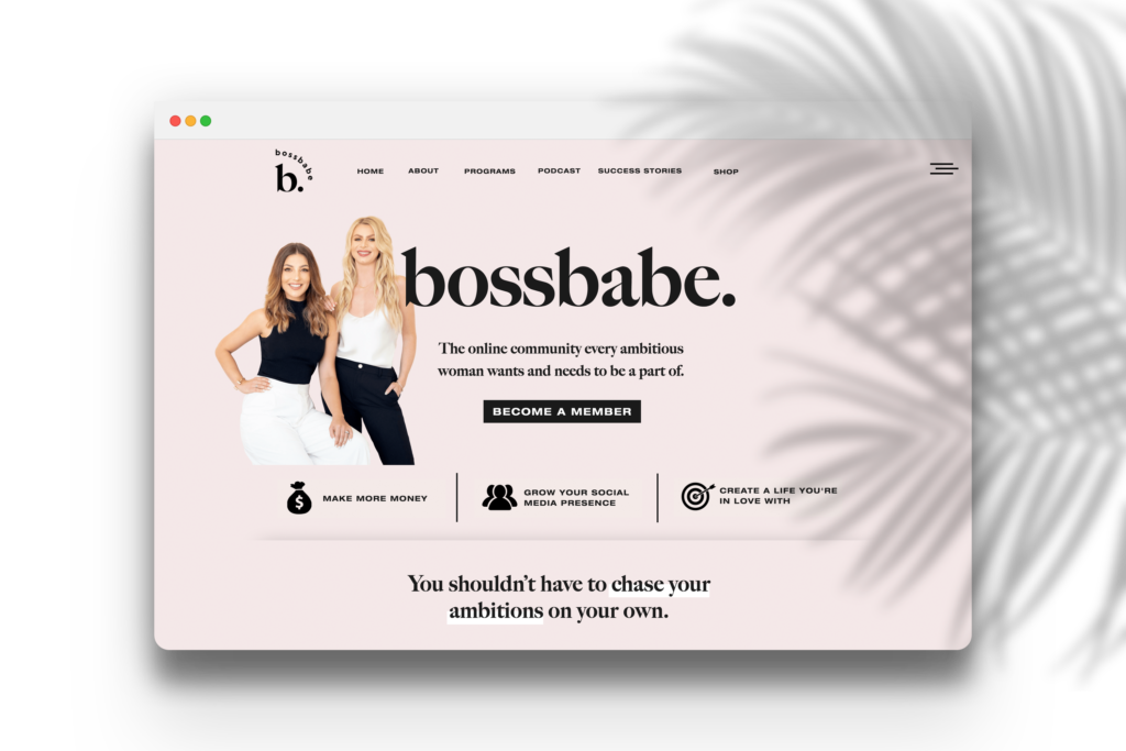
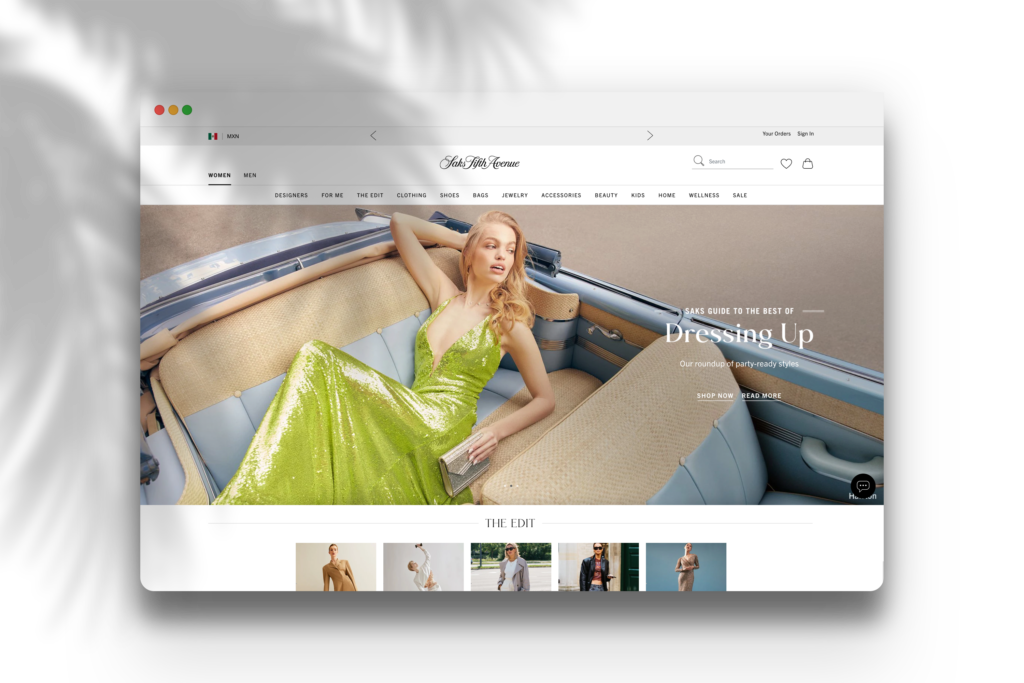
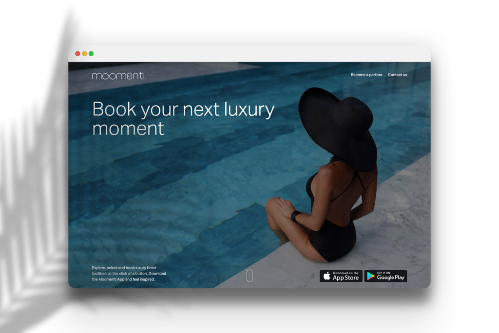
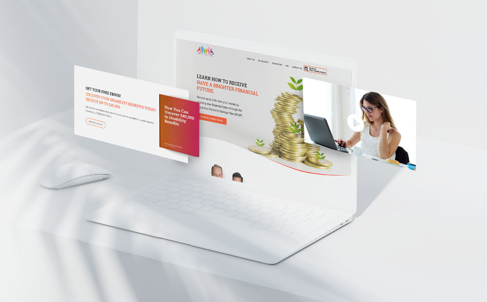
Hero sections are typically big, eye-catching images that can be found right below the navigation bar on the web page. The tagline and mission statement for this section should make it easy to understand what your business is all about without reading any further!
The hero section is the MOST important element of your website’s homepage. This is the first thing your site visitors see and it directly influences conversion rates on your website.
A big mistake I’ve seen is when the small businesses put in the hero section “Welcome to our website” as a tagline, and an even bigger mistake put an image of an owner watching somewhere else but the camera.
Choose your hero image wisely.
If you are planning to use your own picture “look into the eyes” of a website visitor.

You can also use pictures/screenshots of your products.

Or pictures that make you feel in a special way.

Perfect your tagline.
Your tagline must tell immediately what product you selling or what service you providing. You don’t need to be fancy or clever about it – your potential customers must understand your tagline without extra explanation.
Keep it short, sweet, and to the point.
List benefits of working with you.
After someone reads your tagline, they should know what you’re offering. Now is the time to list some benefits. This is your chance to really sell yourself and your services.
Answer these questions:
- What do you offer that is unique and valuable?
- Why should website visitors use your services over others?
Tell visitors how big of an impact you can provide for them. You can also add here your story of WHY you started your business in the first place – it will make your brand more memorable. Based on research people remember stories 22 times better than any fact.
Be clear, concise, and persuasive.
Overview of services & features
Once you’ve convinced your visitor that he needs your services, it’s time to give a more detailed look at what you have to offer. This is where you can go into more detail about the different services and features that you provide.
It’s important to make sure that you clearly and effectively describe your services. This will not only help potential customers understand what you have to offer, but it will also help them to decide if your services are a good fit for their needs.
When crafting a description of your services, there are a few key points to keep in mind.
1. Be as specific as possible. Use language that can be easily understood by your target audience.
2. Focus on the benefits of your services. What will your customer gain by using your product or service? Don’t just say that you offer “design services”; explain exactly what kind of design services you offer, and what kind of results you can provide for your clients.
3. Use strong verbs to convey the quality of your services. For example, instead of saying “we offer a clean, comfortable room”, say “our luxurious rooms will make you feel right at home”.
4. Include pricing information. This will help website visitors to understand the value of your services and make a more informed decision about whether or not to use them.
If you offer only one service, you should also include a “How it works” section.
A ‘how it works’ section is designed to give visitors an overview of how the business works and what they can expect from the services offered. The goal is to provide visitors with a clear understanding of the process of providing a service without overwhelming them with too much information.
Don’t forget to make it fun.
Social proof elements.
Ideally, your website should encourage trust amongst its visitors. With social proof elements, like testimonials, trust icons, and case studies you show that your business is trustworthy.
93% 0f customers will read online reviews before making a purchase.
dixa.com
If your business is getting positive feedback from your customers, capitalize on these. Show off your most impressive case studies or customer reviews. Make them prominent in video interviews or in detailed stories based on data to help explain your influence. Testimonials help build credibility and show people that you’re able to trust your decision-making.
A clear call to action (or two)
Whenever anyone visits your site they should should “know“ what to do next.
What is call to action (CTA)?
Call to action is an element of website design or marketing that encourages visitors to take the desired action. The desired action can be anything from signing up for a newsletter to making a purchase. typically use persuasive language and visuals to encourage users to take the desired action.
Calls to action are often found in the form of buttons, which makes them easy to spot and click on. But they can also be found in other places, such as in the body copy of a web page or in an ad.
An effective CTA should be:
- Clear: The visitor should know exactly what you want them to do.
- Actionable: The visitor should be able to take the desired action with ease.
- Relevant: It should be relevant to the rest of the content on the page.
- Visible: It 78should be easy to see and not hidden away.
Here is a great example of effective CTA:
– Sign up now for our free newsletter!
– Get 10% off your first purchase!
– Click here to learn more about our product.
– Try our product for free!
Set aside time with your staff to determine what actions visitors should take when landing on your website. Having many of those elements can confuse the customer.
Show your authority.
Showing your authority on a subject can be as simple as having a blog on your website, where you can share knowledge. When you write informative and well-researched blog posts, your visitors will see that you know what you’re talking about and that you’re up-to-date on the latest information in your expert area. This will grow their trust in you and your website, making them more likely to buy from you or use your services.
Listing latest posts on your home page will help visitors discover your expertise faster.
Company name & contact information
Make sure that the visitor has immediate access to your company’s contact information. Your operational hours, map with directions to the business location, links to your social media profiles – everything that will make visitor closer to becoming your customer.
Imagine, if you made an amazing impression on a website visitor, he decides to use your services and went for your competition just because he couldn’t find contact information. It will be an awkward situation, don’t you think?
Conclusion
The homepage is the first page to see when a visitor arrives at your website. Having all the right homepage elements in place will help your visitor learn about your services and make an informed decision to work with you faster. This is why your home page should have a good hero section with an attention-grabbing headline and image, a paragraph or two of why someone should choose your services, lists of what you offer, a social proof, a call to action, and finally the latest post from your blog. Make sure you also include contact information on your homepage so customers can easily get in touch.
If you liked this article, please share it with others who might find it useful! And be sure to subscribe to our blog for more great tips to improve your website’s conversion rates. Thank you for reading!

