The property management company’s existing logo, while familiar to its audience, no longer fully aligned with the company’s evolving identity. However, the client did not want to completely overhaul the design, preferring instead to refresh the logo while maintaining recognizable elements. The challenge was to modernize the existing logo without losing its core identity, making it more adaptable for digital platforms and visually appealing in contemporary design contexts.
The goal was to enhance the current logo while:
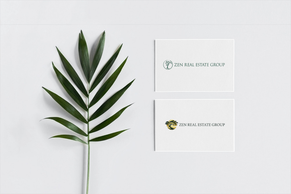
Preserving core design elements to maintain brand recognition.
Updating the logo to reflect the company’s modern, professional values.
Improving its versatility for use across digital and print mediums.
The Solution
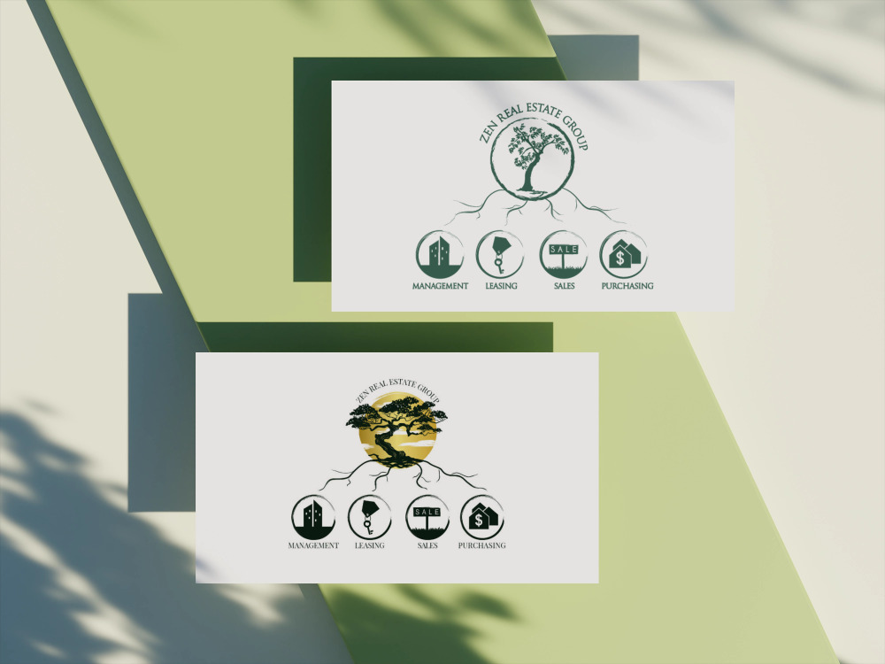
We refined the existing logo by making it more defined and enhancing its professional appearance. To add a touch of sophistication and elevate the brand’s identity, we introduced a gold accent, which brought elegance and vibrancy to the design. This subtle addition made the logo less monotonous, giving it a luxurious yet approachable feel while maintaining its core recognizability. The result was a refreshed logo that was not only modern but also conveyed a sense of prestige and refinement.
The client appreciated the careful balance of retaining familiar elements while incorporating modern design features. The final logo achieved the desired refresh without alienating long-term customers.
This logo refinement project was a perfect example of how small, thoughtful changes can lead to a significant brand impact, all while preserving the brand’s heritage and identity.